Jack Hanley Gallery Sept 6 - Oct 7 2018
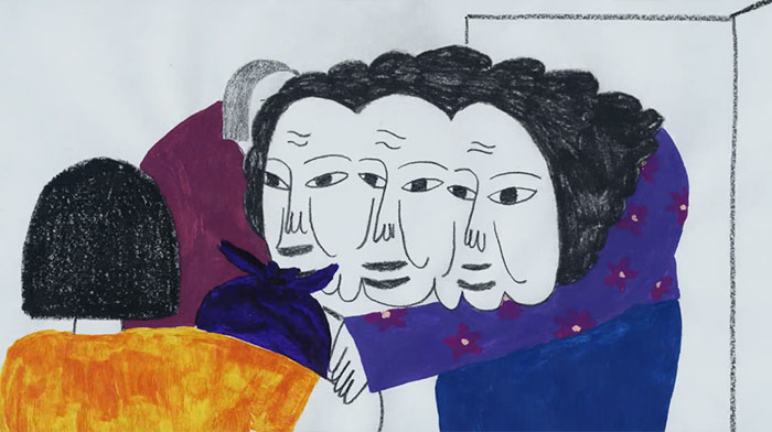
Jack Hanley Gallery is excited to present Access To Tools, Maia Ruth Lee’s first solo exhibition with the gallery. Lee’s work addresses the economy of language, new lexicon, alphabets and their transposition into systems of signs and symbols. Like language itself, her work combines structure and practicality with implicit subtleties that shape her own visual vocabulary in a range of mediums.
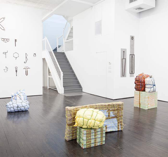
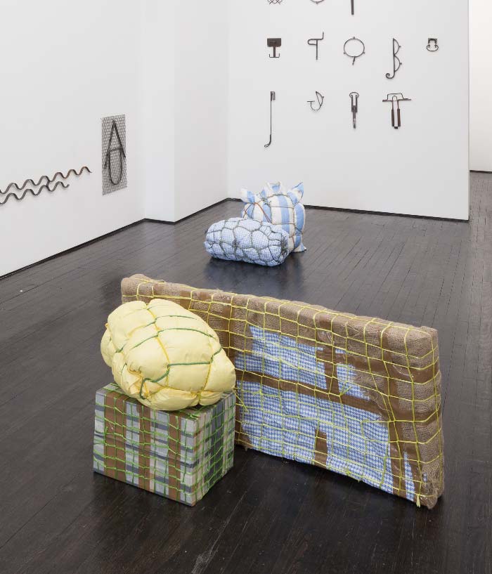
Auspicious Glyphs are a series of wrought iron wall sculptures reconstructed from found scraps that are isolated and combined into a glossary of glyphs. The decorative elements are originally used to embellish structures that secure boundaries, adorning fences and window bars around New York City. In the accompanying chart Nine Glyph-Tools for Self-Defense, the lexicographical notion of glyphs is further transformed into a practical set of tools that can activate a mental self-defense to protect oneself against their own fear, sorrow or jealousy.
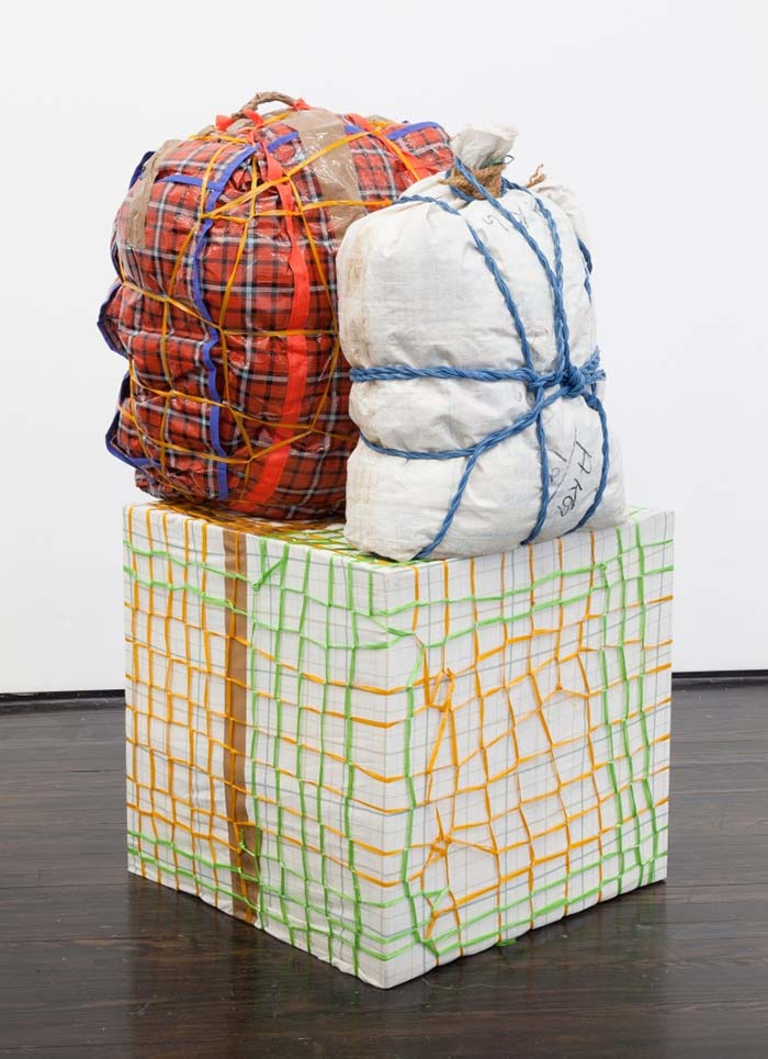
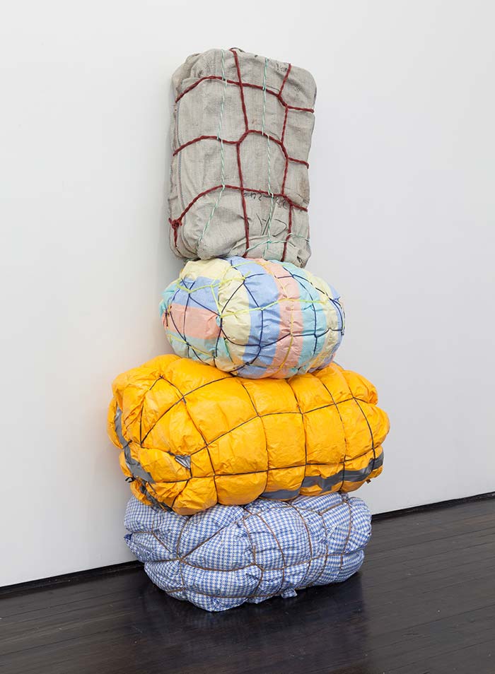
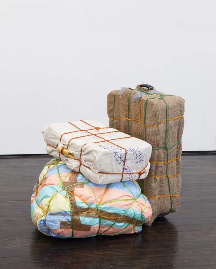
Bondage Baggage is a series of sculptures based on Lee’s observation and documentation of luggage at the Kathmandu International Airport in Nepal over the past five years. About a third of Nepal’s GDP is generated through Nepalese migrant workers who carry out labor in the Gulf and Malaysia. Upon return to their country, they frequently bring back valuable goods like electronics or clothes with them, disguised in a unique way to protect their newly acquired valuables from possible theft at the airport security. Wrapped and bound with variously colored tarp, rope and tapes, the meticulously packaged luggages combine practicality and creativity while carrying their own personal stories through space and time.
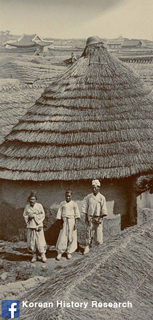
Lee’s video projection The Stranger shows footage of her father’s documentation of Nepal in the late Eighties. His tapes survey the environment that Lee and her family trekked through for his linguistic research of the villagers in the Himalayan area. In the second part of the video, 25 years later, Lee continues his survey, accompanying her father’s early contemplations with her own journal entries.
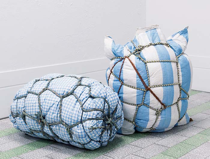
Prototypes I & II , Size variable, tarp, tape, rope, fabric, Courtesy of L'inconnue Gallery 2018
Maia Ruth Lee is an artist and educator.
In 1983, Lee was born in Busan, South Korea. Lee's parents were Christian missionaries. Lee grew up in Kathmandu, Nepal.
Lee has a Bachelor of Fine Arts degree from Hongik University in Seoul, South Korea. Lee also studied at Emily Carr Institute of Art and Design in Vancouver, Canada.
As an artist, Lee has exhibited her art in New York, Los Angeles, and Montreal. Lee's first solo exhibition was at Eli Ping Frances Perkins in New York. In 2017, while Lee was pregnant, she modeled for fashion brand Eckhaus Latta's spring 2018 show. Lee is a director at the arts-focused non-profit group Wide Rainbow. In September 2018 to October 2018, Lee held a solo exhibition of her sculpture pieces at Jack Hanley Gallery. In February 2019, Lee was selected by curators Rujeko Hockley and Jane Panetta as a participating artist in the 2019 Whitney Biennial, opening in May 2019 at the Whitney Museum Of American Art in New York City.
maia ruth lee