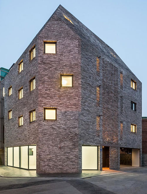
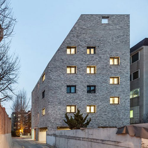
Beyond the Screen is a new type of residential complex, located in Naebalsan-dong, Seoul. The existing condition of this residential neighborhood is no different from most other neighborhoods, with multi-plex housing having held the majority. The aim of this project was to offer a compact spatial richness for living, while finding new architectural solutions in satisfying the specific needs of the user, client, as well as contributing to the improvement of the typically generic townscape so familiar in Korea.
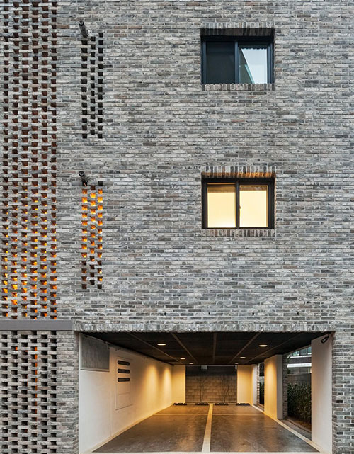
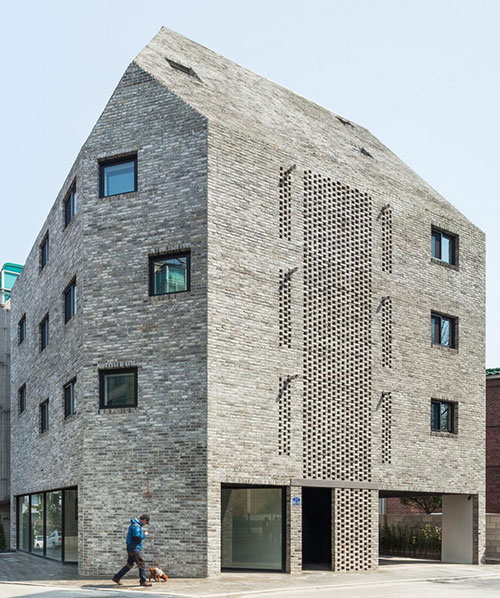
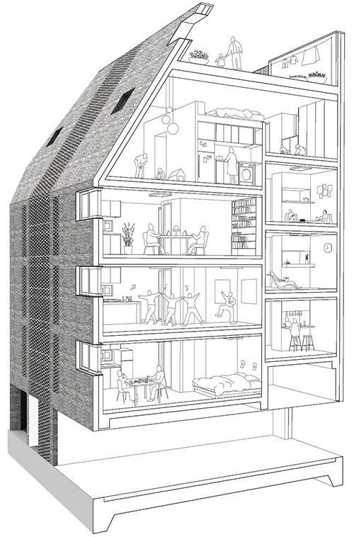
The building sits at a corner condition and is formed by a cutting and shaping of the volume by influences of the site regulations such as setback lines and natural light requirements. The outer appearance is a single mass, however, it is actually two masses bridged by a semi-exterior central stairwell with a unique brick screen to the front and back, forming an H-shaped plan, with a skipped floor structure from the east to west. This five-story building incorporates both residential and commercial functions – the first floor with a café and a piloti parking space, and from the second to fifth floors, four different unit types making up 14 different units in total.
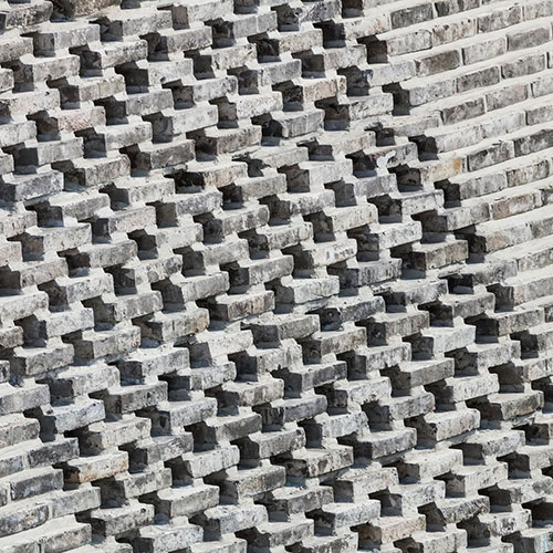
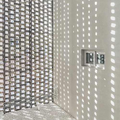
From a user’s perspective, the design took into consideration the following four points: 1. Courtyard: Upon entering the building, one encounters the courtyard with a semi-exterior stairwell that provides access to each of the 14 units, with a unique brick screen to the front and back. This screen filters the view into the building from the front, while allowing for the right amount of natural light and ventilation, creating a far more pleasant atmosphere in and around a stairwell. The sun light that filters through the bricks makes for a lovely courtyard, allowing for an atmospheric transformation throughout the day, every day. 2. Natural Ventilation: By splitting the building into two volumes, it allows all of the units to have 3 open sides, maximizing the natural cross ventilation throughout. 3. Roof Garden: The roof garden is open to the sky, with a parapet wall at full-floor height, creating a private communal space for the residents. 4. Privacy: The brick screen walls, in their orderly staggered stacking construction, allows for privacy from the exterior gaze of the adjacent buildings into the semi-exterior, semi-public core of the building. This filter is applied, not only in the central core zone, but at specific moments where the building closely faces adjacent buildings. This adds to the privacy of each unit, while allowing for the residents of each unit the flexibility in ventilation, allowing each unit to breathe naturally.
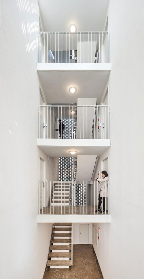
The design also takes into consideration the client’s point of view, with an attempt to satisfy cost efficiency and profitability through quality design: 1. Area: The skipped floor structure allows residents to enter their units directly from the stair landings, eliminating unnecessary, dead public hallway space, and maximizing the area for exclusive use. 2. Cost Efficiency: With a limited construction budget, but aiming to satisfy all of the essentials for living, the design of the building and the units focused on only the absolute necessities, without being superfluous with custom materials and built-in furniture, but with quality materials and fixtures that were economical. 3. Unique: In order to provide the client with something new and different from the monotonous characteristics of the area, their needs were met through a quality of design that allows the building to stand apart within the existing streetscape of multi-family housing, both formally and in function, resulting in a new type of residential experience and use.
As designers, there was a need to find a new architectural solution for the unexpected and unplanned, such as the following: 1. Equipment: It is quite common for residential buildings to attach and expose air conditioning equipment on the exterior of the building. In order to keep to the intended design of all four elevations of the building, spaces were allotted for such equipment into the overall plan of the building, as well as an application of the brick screen system for ventilation and air circulation for HVAC. 2. Ad-Hoc Expansion: To avoid illegal additions and extensions to the original design of the building in the future, which is a common practice in Korea, especially to buildings lacking a specific logic, there was a great focus in efficient spatial planning and design to allow for longevity in the initial design intentions and the spatial organization of the building. 3. Harmonized Distinction: A unique design calls attention from its surrounding neighbors and residents in sparking an interest in a new design sensibility, and to form and awareness and appreciation for beautiful buildings and well designed spaces for living. Due to the changes of living patterns in the city, the number of single to double occupancy living units has grown. Rather than contribute to the increase of thoughtless and monotonous residential typology, the focus of Beyond the Screen was to provide new architectural design solutions to improve the quality of compact living through and enrichment of spatial qualities and functions.
Project: Beyond the Screen
Building name: NBS71510
Design period: 2012.06 - 2012.08
Construction period: 2012.09 - 2013.02
Type: residential, commercial
Location: Seoul, South Korea
Site area: 215 square metres
Site coverage area: 128.08 square metres
Building-to-land ratio: 59.57% (max. 60%)
Total floor area: 427.24 square metres
Floor area ratio: 198.72% (max. 200%)
Building scope: 5F
Structure: RC
Finish: brick, Dryvit
Beyond the Screen - Photographer kyungsub Shin
OBBA