User inserted image

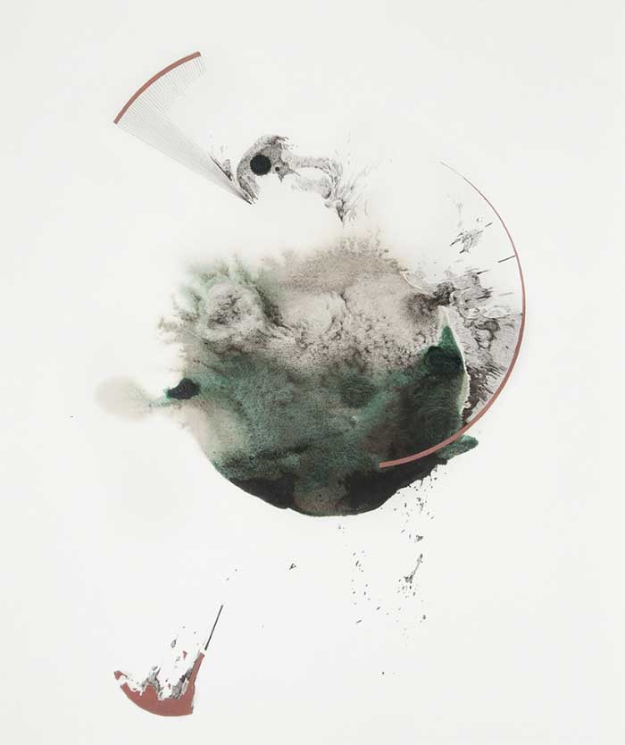
Hong san, 2016, Encre de Chine et acrylique, 13 4/5 × 16 1/10 in; 35 × 41 cm

User inserted image

Pour mieux dormir, 2016, Encre de Chine et crayon de couleur, 6 3/10 × 9 2/5 in; 16 × 24 cm

User inserted image

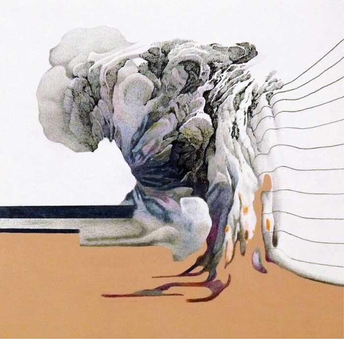
La fin de la journée, 2014, Indian ink, watercolour, acrylic and colour pencil on paper, 7 9/10 × 7 9/10 in; 20 × 20 cm

User inserted image

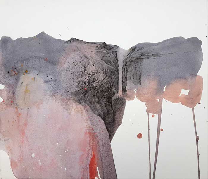
Île 1, 2015, Indian ink, watercolour and acrylic on paper, 16 3/10 × 19 7/10 in; 41.5 × 50 cm

User inserted image

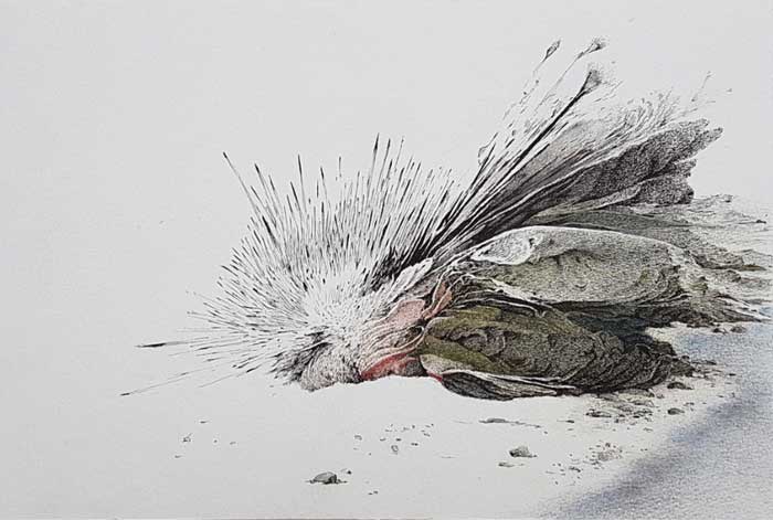
Migrateur, 2015, Indian ink and acrylic on paper, 10 × 12 1/5 in; 25.5 × 31 cm

User inserted image

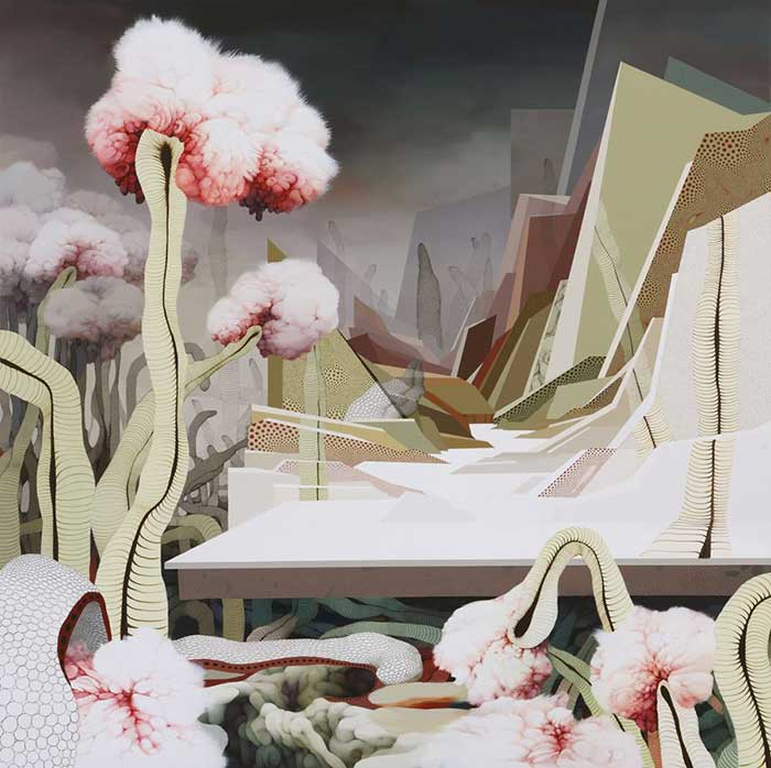
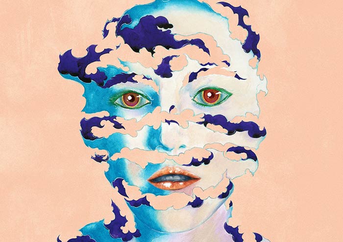
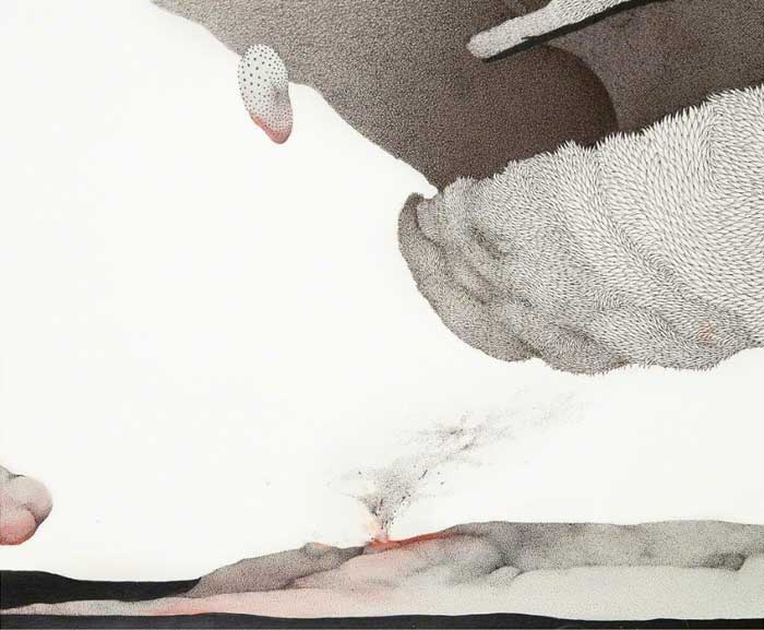
Jung Yeon Min’s works are highly imaginative and rich. One finds multiple worlds, the extraordinary and the realistic, notions of micro and macro, and manipulations of space and time in her work. Specifically, her work offers two equal but divergent investigations. On the one hand, she envisions and explores a mysterious and fantastical world. In a separate but concurrent investigation, she examines the effect of time in the pictorial realm. Sometimes colliding, these two points of inquiry form an intriguing basis for a closer reading of Min’s works as opening up places of potential and possibility.

In the realm between the real and the virtual her paintings present imaginary worlds asking us to search for their specific force, their capacity for rupturing and transforming life. Tracing this force within her works offers an understanding of what her artwork achieves and her vision of our potential. Understanding her virtual world involves questioning the very possibilities of life. Min does not want us to see her worlds simply as familiar experiences; while she uses perspective as a technique to produce a sense of comfort and familiarity, she jolts us with a sense of the strange at the same time.

Her paintings show Min’s integration of the familiar world with that of the strange. While she uses perspective to demarcate the division between the world that we know and the virtual world, she emphasizes seeing strangeness in an environment that is known and safe. By displaying various perspectives of time and temporality in many of her works, she seems to interrogate the concept of time and its effects. We are left questioning, what in the painting is waiting for a transformation to occur?

Min never settles this question for us, leaving us unsettled about what exactly we are supposed to seeing, what we are supposed to be waiting for. Thus, she disturbs our conventional understanding of time as a progression, from one event or occurrence to another, to a more multi-layered perspective. The presence of realism allows the fantastical world to make sense, so what would otherwise seem strange becomes familiar and inviting. She disarms resistance to this otherness, change and difference. Her worlds offer a way of being that breaks out of boundaries, both geographical and temporal, and that challenges us to envision a life beyond convention.

Jung Yeon Min

User inserted image

SOUND & VISION, POSTER

User inserted image

WELL'S FARGO, INLAY ILLUSTRATION FOR THE WATCH OUT! 12" RELEASE BY VINYL ME PLEASE AND NOW AGAIN RECORDS

User inserted image

ECHO, CONCEPT ART • 12 MAIL EXHIBITION

User inserted image

CALVI ON THE ROCKS, POSTER

User inserted image

LE VOYAGE INTERIEUR FONDATION ELECTRA, EXHIBITION POSTER

User inserted image

LE PRINTEMPS DE SEPTEMBRE, EXHIBITION POSTER

User inserted image

HERMAN MILLER, EAMES WALNUT STOOL POSTER

User inserted image

SECRET SOCIETIES, EXHIBITION POSTER / SCHIRN KUNSTHALLE FRANKFURT / CAPC, BORDEAUX

User inserted image

HE BEWITCHED HANDS, BIRDS AND DRUMS ALBUM COVER

Sanghon Kim is a French/ Korean artist/graphic designer living in Paris.

A fine-art and graphic-design graduate of the Beaux-Arts in Paris, Sanghon Kim is a talented jack-of-all-trades capable of moving from watercolours to computer work in his search for a strong visual universe. His art of mixing techniques gives the work an air of mystery; you’re never sure whether you’re looking at a photomontage, computer graphics or an actual drawing, which is undoubtedly part of his plan to hide his tracks, unnerve the viewer and create dissonant feelings.

His airy, poetic and unique style has allowed him to adapt to different types of work, including fashion, illustration, typography and graphic design.

With so many strings to his bow, it should come as no surprise that he’s already a favourite with a number of labels and artists. He’s worked with Lacoste, Nike, Christophe Lemaire, Hermès, Tate Modern, Air and Bewitched Hands

Sanghon Kim

User inserted image

RADAL wallet TENT FRAME COVER 230mm x 145mm

KANEI TEI is unique in a way that the materials used have all been part of differnt historyies. Some date back to the WWII era while others had been used in wartime preparations in the middle east, resulting produced in a unique look and feel for each item designed and produced. Inspired by the irregular yet discplined surfaces of a military tent fabric, our products show off an urban vitage look that simply cannot be imitated artficially.

User inserted image

AMMO XL TENT FRAME COVER 460mm x 290mm x 260mm

User inserted image

TIGER TENT FRAME COVER

User inserted image

STONE C-TENT

User inserted image

CONCRETE C TENT 330mm x 440mm x 190mm

User inserted image

MATHILDA L TENT FRAME COVER 480mm x 425mm x 155mm

User inserted image

WABI wallet C TENT 110mm x 105mm x 20mm

Kwan-young Chung is a Japan-born Korean designer. After spending his childhood in Korea, KANEI TEI obtained a business degree in America.

He then established the brand KANEI TEI with Faye Lee, the creative director of 21Defaye. KANEI TEI originally aspired to be a philosopher, and that is why you can count on his designs to be thought-provoking. However, being a fashion designer, he makes sure that beauty should the first and foremost subject in his creations.

KANEI TEI


ⓒ copyrights 2003-2018 Designersparty, all rights reserved. all material published remains the exclusive copyright of Designersparty.